Difference between revisions of "User Interface Refactor"
Bradymiller (talk | contribs) m (1 revision: second) |
Bradymiller (talk | contribs) m (10 revisions: User_Interface_Refactor) |
(No difference)
| |
Revision as of 21:36, 24 April 2012
Sponsored by OpenEMR Support, LLC, Development effort by Medical Information Integration, LLC and Visolve
- Project started November 15, 2009
- Target completion end of December 2009 for first iteration and integration pass
- Working from Tip with weekly integrations into our base,
Gory, ie: technical details can found at User Interface Refactor - Functional Design
The information below is the basic mission. As the prototyping advances.
NAVIGATION REFACTOR
Remove the multi-frame aspect of the UI, such that the left-hand nav is replaced by an enhanced top nav userbar, and all screens load at the bottom of the screen in a single iframe (instead of a top and bottom frame).
This cleanup step will greatly simplify the user experience, which now has the added burden of figuring out where load a menu selection (top? bottom?) and to having to resize.
The top-menu userbar will constitute primarily of drop-down, cascading menus, which will be designed to be easily extended (ideally driven by a configuration file of some type); a minimal 'current patient' widget, which when hovered over or clicked produces a DIV popup (not window popup!) with more details; a search widget which when typed in produces a DIV popup with search options (Any, Filter, etc.); and the currently logged in user + log out button.
LOOK-AND-FEEL REFACTOR
All non-custom pages will be standardized as much as possible:
- Sort out what should be buttons, and what should be links; all buttons generated using CSS, and using the same mechanisms site wide
- General font styling to make every page consistent.
- Consistent treatment of column/tabular data (such as lists of things and reports)
- Elimination of heavy-weight javascript popups in favor of lightbox-style in-page modals
- Reduction of the need for scrolling using tabbed menu treatments
- Refactor of pages where javascript, php, css, and html are too tightly coupled (for ease of styling)
- Re-write of select pages as time permits
Examples of Main Demograhics layout
--here--
Examples of Report Launch layout
--here--
WORKFLOW REFACTOR
This is work at the root of usability issues in OpenEMR -- there aren't any wizards in to guide users through their typical workflows. To this end, we will:
- Identify the typical workflows used by most organizations
- Create a wizard API which must be implemented by pages wishing to participate in the wizard
- Workflows will make use of breadcrumbs and next/back user paradigm whereever possible
- Implement a standard set of workflows
This work is dependent on some degree of overall site look/feel refactoring, as well as a general re-tooling of the navigation structure of the site.
Accounting Work Flow
OpenEMR's practice management and accounting processes need to be reworked to meet more industry standards for use and practicality.
Here is formal Gap Analysis review done by MI2, Sam Bowen and Dr. Schaffer: Gap Review PDF
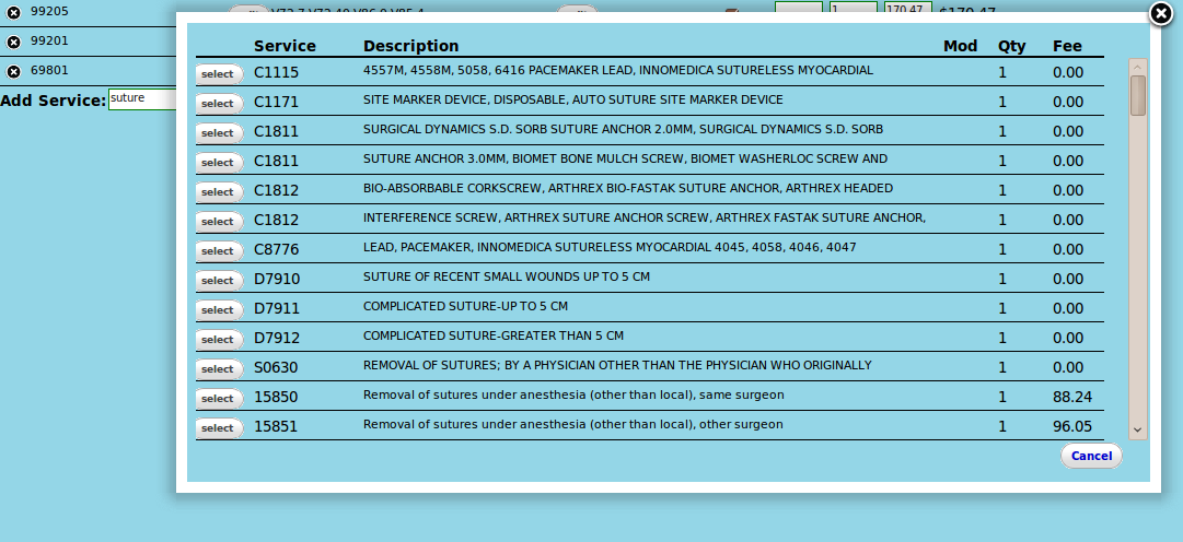
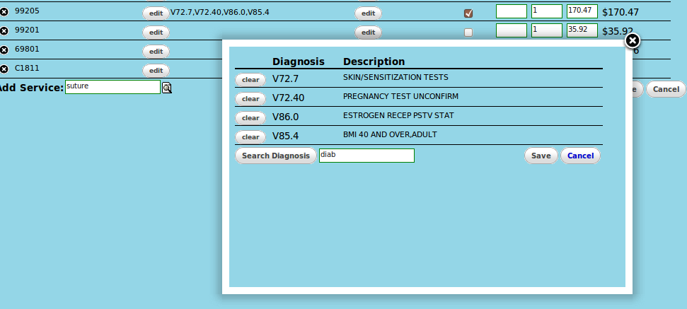
And some screen shot of AJAX (JQuery) based charge entry, diagnosis and service code tools. This uses the same backend as the Fee Sheet tool. The modal windows weill be able to be called for multiple places, not just the charge entry module.
- Charge Entry
- Service Code Lookup
- Diagnosis Look up and Justification
- Claims / Billing Report Batch Screen changes
With Errors from EDI response files (TBD manual error entry for paper EOB/EOP)


